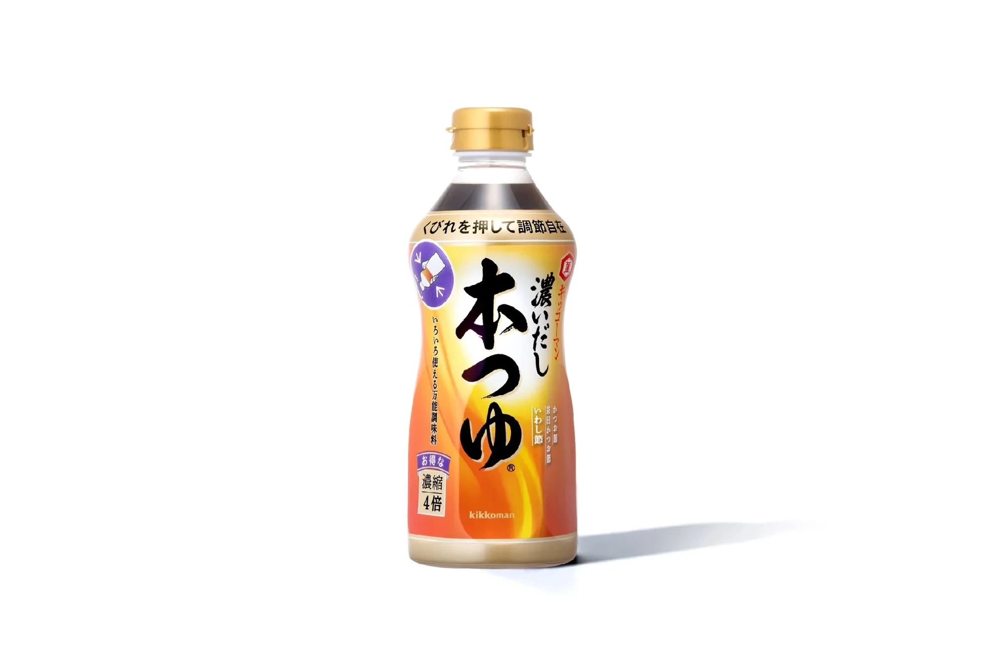
koi dashi hontsuyu
2016〜
This project served to revamp the image of the product in question, a concentrated dipping sauce with a natural soup stock base whose image hadn’t been changed in more than twenty years since its 1995 launch. The design combined a bottle with an indented shape that could be squeezed for easy pouring and a new color – orange – used to convey the wafting scent of the soup stock rising as a result of the new soup stock extraction method employed with the product. The design was conceived to convey the fresh appeal of the product to both established and new consumers.
koidashi hontsuyu
Art Director : Ichiji Ohishi
Designer : Ichiji Ohishi / Miki Ito / Ichitaro Suzuki
Client : Kikkoman food products company