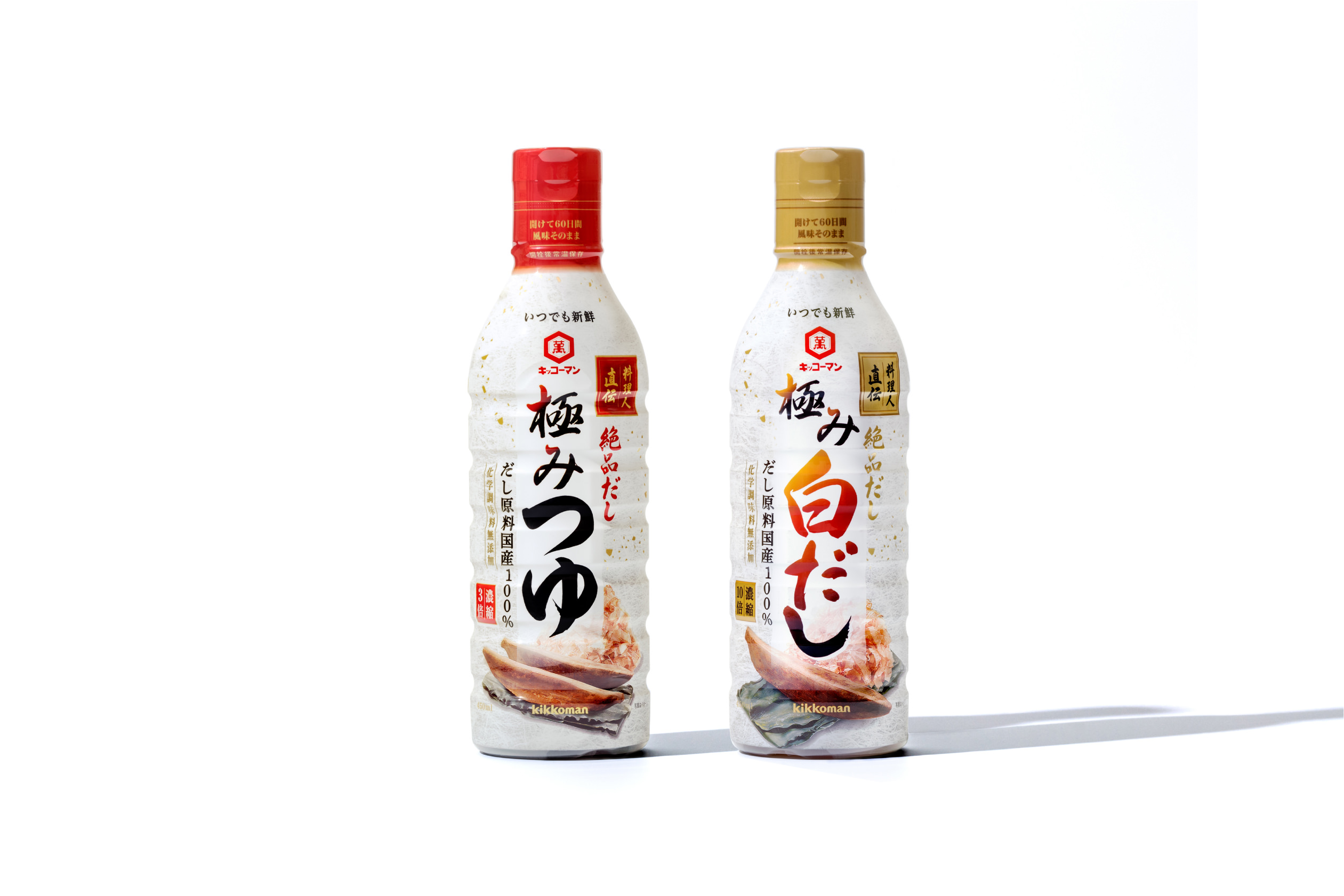
koi dashi hontsuyu
koidashi hontsuyu / 2016〜
koi dashi hontsuyu
koidashi hontsuyu / 2016〜

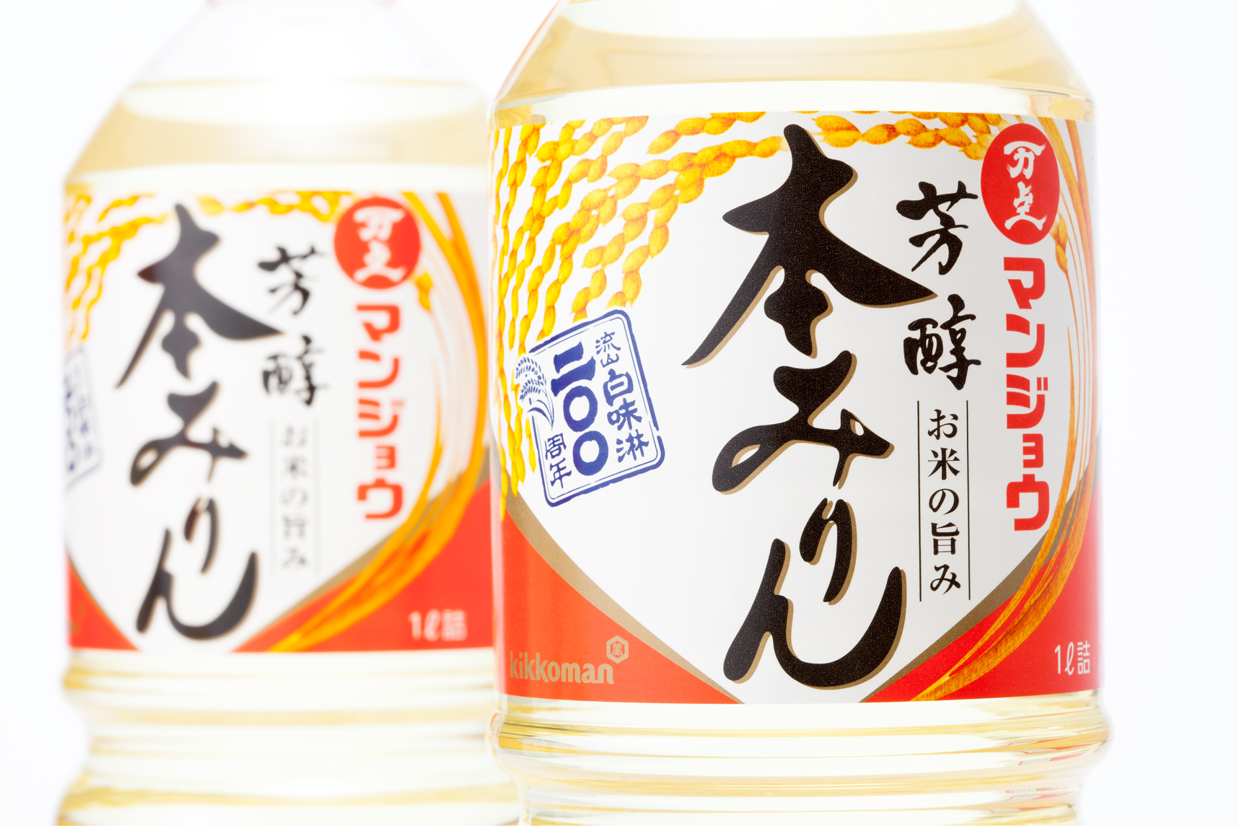
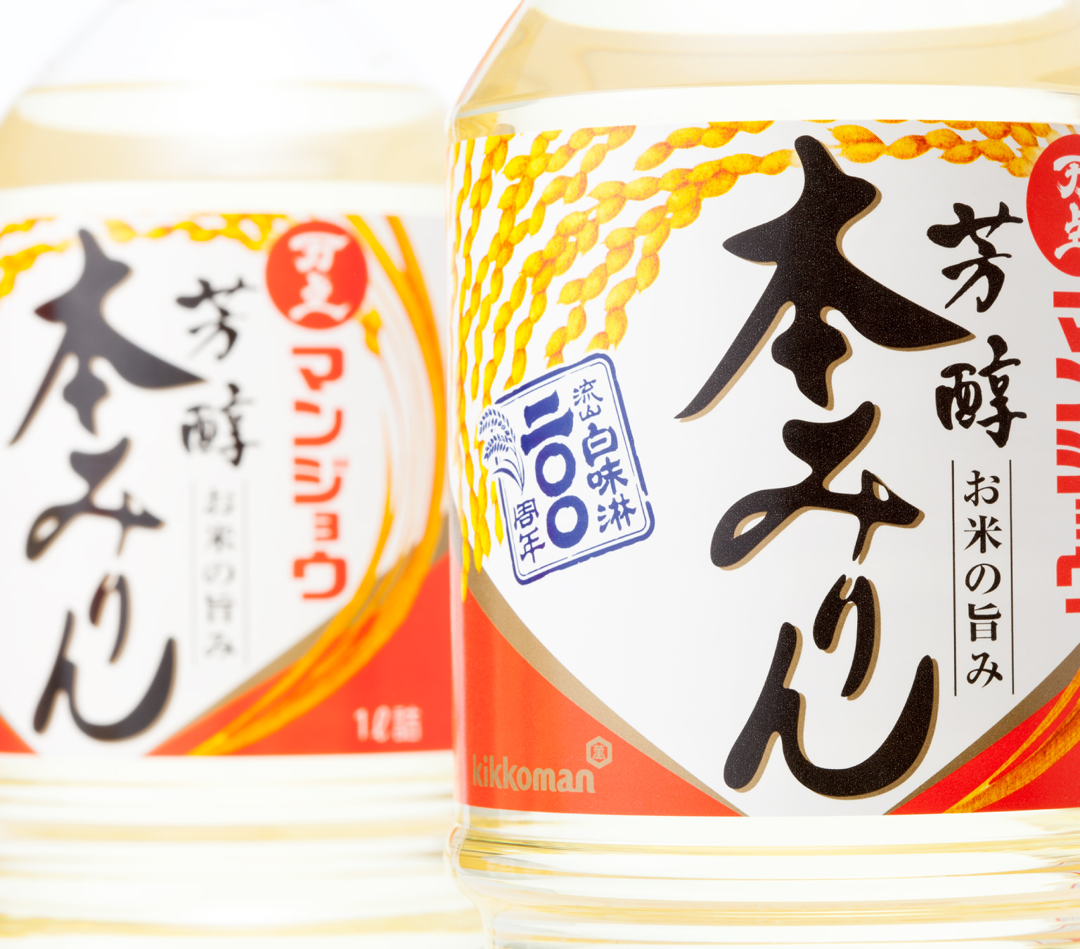
manjo honmirin / 2014〜
To mark Manjo Honmirin’s 200th anniversary, its label design, unchanged for 15 years, was fully revamped. We developed a design employing a bold illustration of ears of rice arranged around lettering finished in a calligraphy style to highlight the fine quality of the ingredients. A red color field was employed to reinforce product presence and to directly convey the umami found in rice.
Art Director : Ichiji Ohishi
Designer : Ichiji Ohishi / Miki Ito / Ichitaro Suzuki
Client : Kikkoman food products company