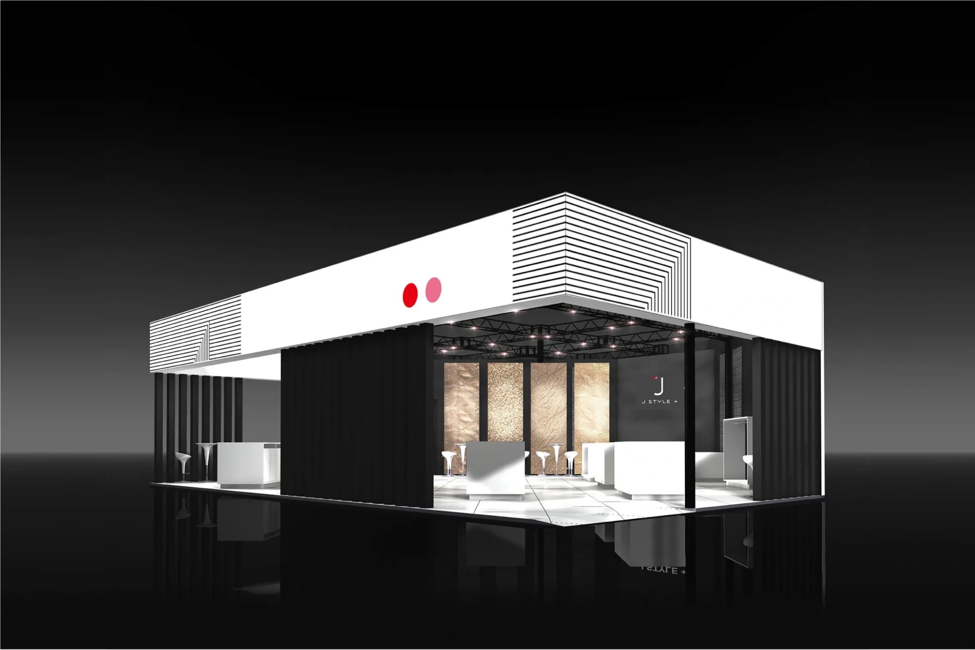
J-STYLE PLUS
2011
Graphics for the Japanese booth at a trade exhibition held in Paris. Since many of the companies participating in the exhibition make use of traditional Japanese techniques, we used two red dots of differing color densities positioned to the left of the letter “J” to indicate the idea of “the past to the present”, with the booth itself being colored with black and white stripes to express the idea of “continuity”.
j-style plus
Art Director : Ichiji Ohishi
Designer : Ichiji Ohishi
Client : Ministry of economy, trade and industry