
intellectual property symposium
intellectual property symposium / 2011
intellectual property symposium
intellectual property symposium / 2011

yubikitasu / 2007〜
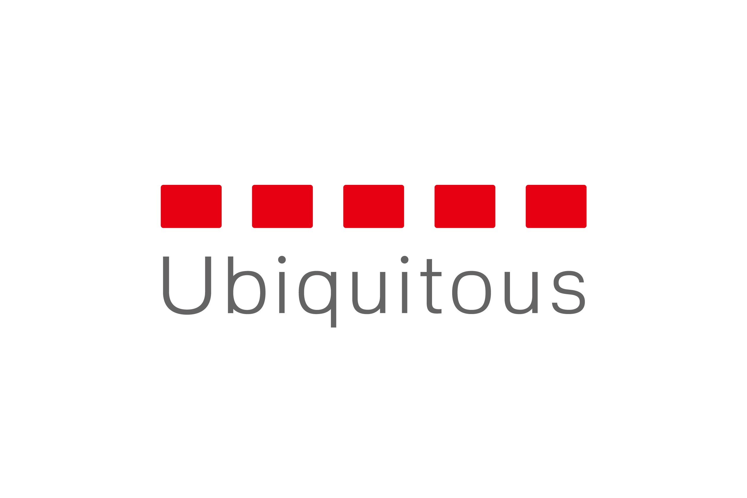
Using the idea of “unseen connections” as a keyword, the dashed red line is a visual identity for the company, which is involved in the manufacturing and sales of embedded software products. A dashed line is usually used as a guideline – for example, to indicate where folds in the paper need to be made when doing origami paper folding. It is also employed as a pseudo marker for the sake of convenience in expressing the presence of things that cannot be seen. The red dashed line symbolizes things that are invisible yet connected and serves as the corporate identity of the company. The color red was used in the company’s previous logo; we maintained this as the corporate color to provide a sense of uniformity with the previous symbol.
Art Director : Ichiji Ohishi
Designer : Ichiji Ohishi
Client : Ubiquitous corporation