okutatara
okutatara / 2017〜
okutatara
okutatara / 2017〜
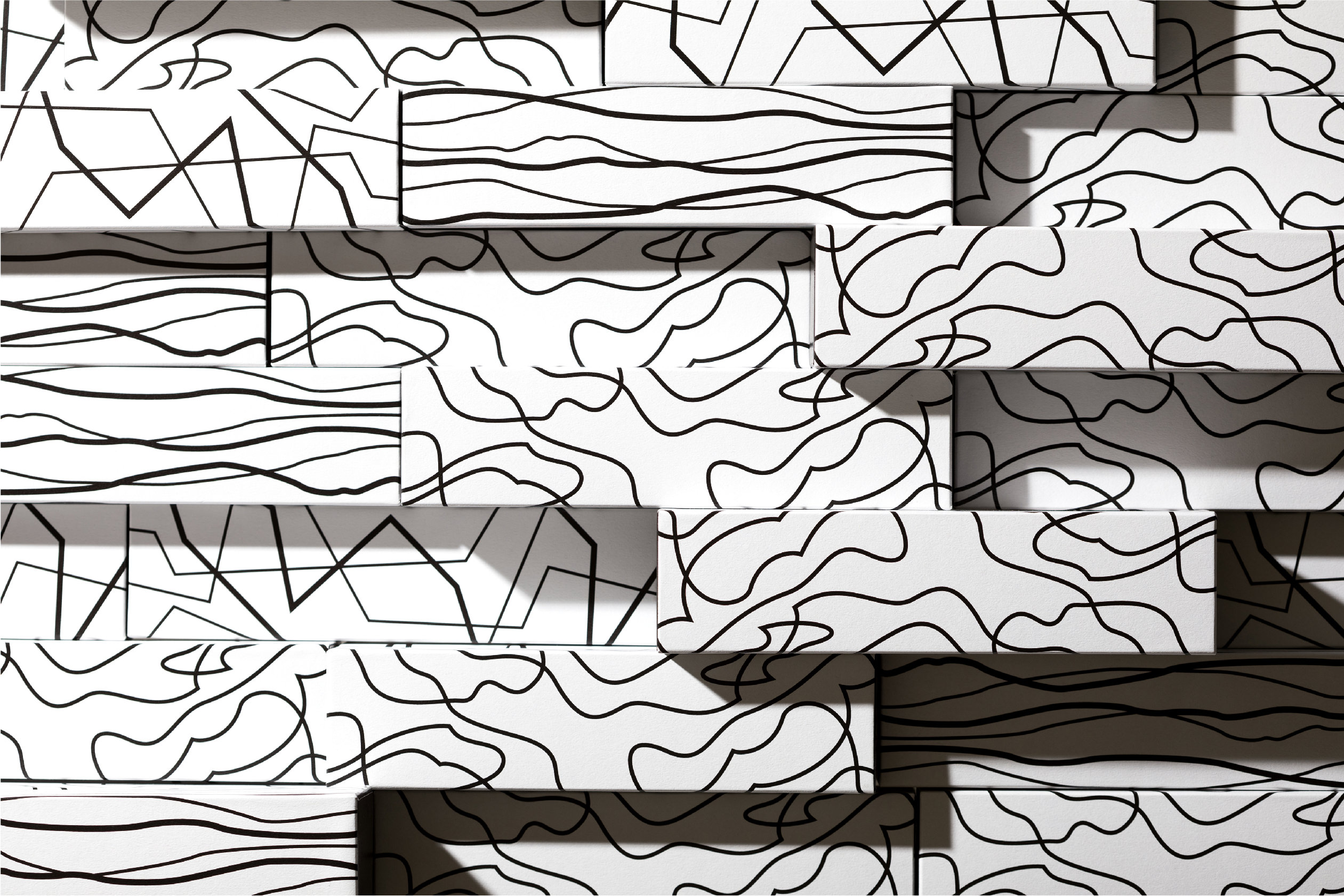

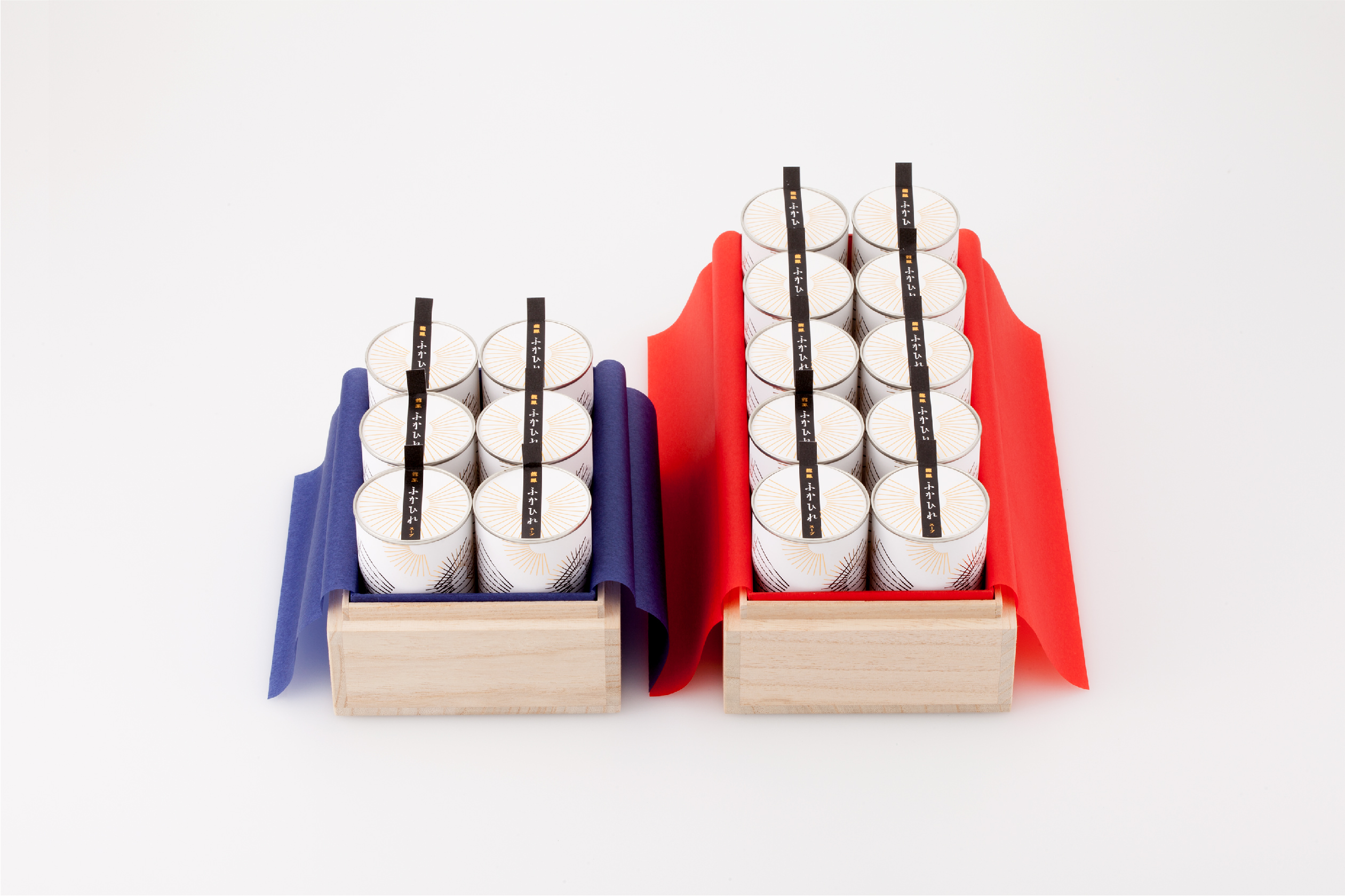
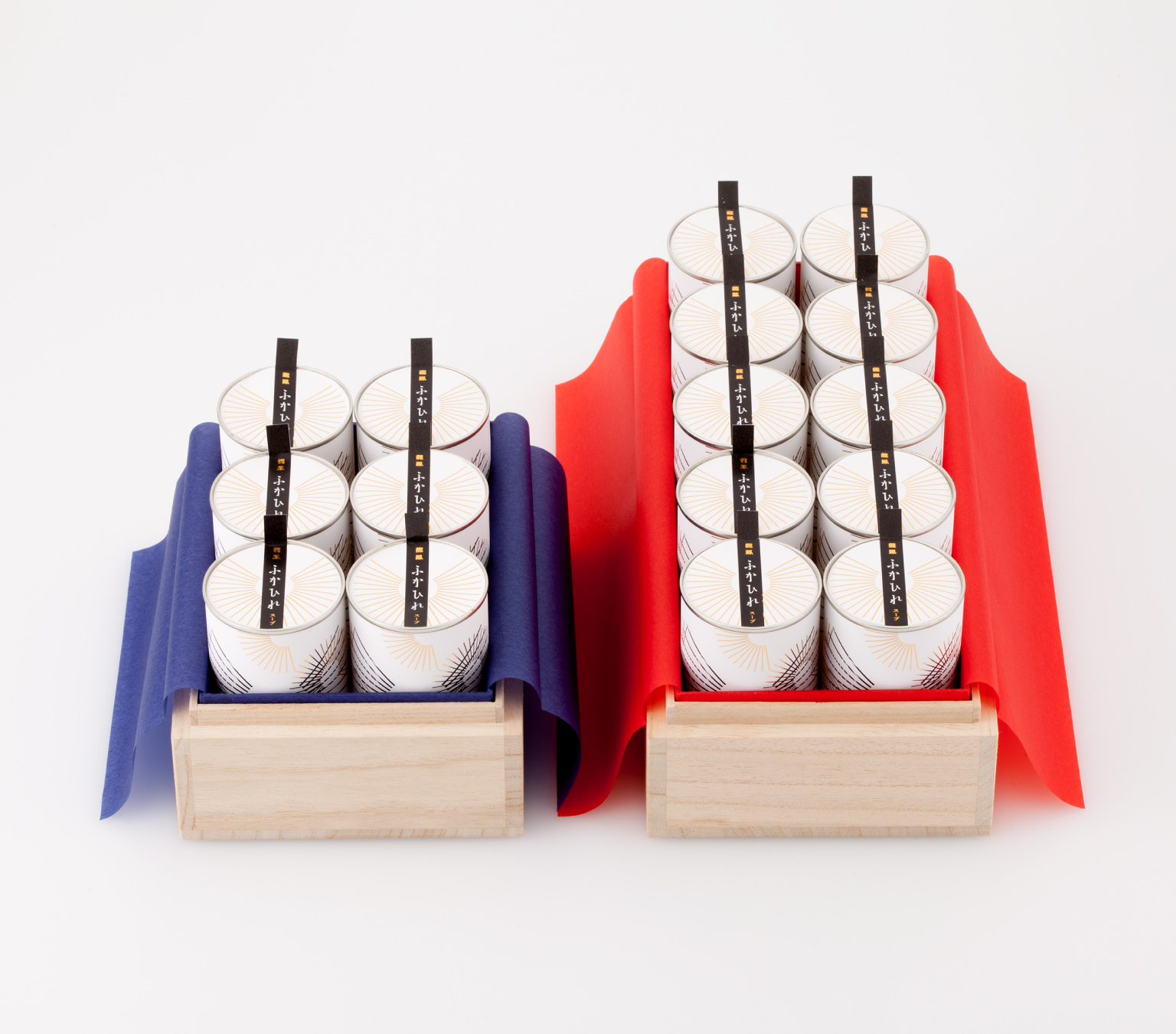
shark fin soup / 2014
Work exhibited at a design event held as part of the Support Tohoku Project. The design is an idea that follows the assumption of the revamping of Kesennuma’s shark fin soup. The radial lines on the packaging have been used to express the fibrous nature of shark fin. The elegant, graceful overlapping lines were drawn in homage to the huge fireworks that light up the Kesennnuma night sky. By adding a modern spin to this Japanese sentiment, our aim was for this product to be recognized as a new Japanese luxury food.
Art Director : Ichiji Ohishi
Designer : Ichiji Ohishi / Miki Ito
Client : Independent production